set.seed(16)
rolls <- tibble(value = sample(1:6, size = 20, replace = TRUE))The Normal Distribution
Intro discussion:
What is quantitative data?
What are population and sample?
In research, we almost always work with a sample. A sample is a subset of the population we are interested in, and we use it to make inferences about the whole population.
When reporting quantitative data, we don’t list every individual observation. Instead, we begin by summarising the numerical information. What are some of these summaries?
Common examples are the mean, median, quantiles, range, and standard deviation.
However, before we jump into reporting these numbers, it is important to first see how our data looks like in terms of its distribution.
Distributions
When we collect data, we observe and record individual instances related to our research question. Each instance is called an observation.
Let’s start with an example from the textbook: rolling a die

Imagine you roll a die 20 times and record the result of each roll. For this lesson, let’s make up the data from this code below:
Here is your empirical data; ‘real-world’ data collected through observation.
print(rolls)# A tibble: 20 × 1
value
<int>
1 1
2 3
3 5
4 3
5 4
6 6
7 6
8 3
9 4
10 1
11 5
12 6
13 2
14 3
15 4
16 6
17 1
18 6
19 3
20 5What is the distribution of this data? With this data, we can count how many times each face (1 to 6) occurred.
ggplot(rolls, aes(x = value)) +
  geom_histogram(binwidth = 1, color = "black", fill = "lightblue")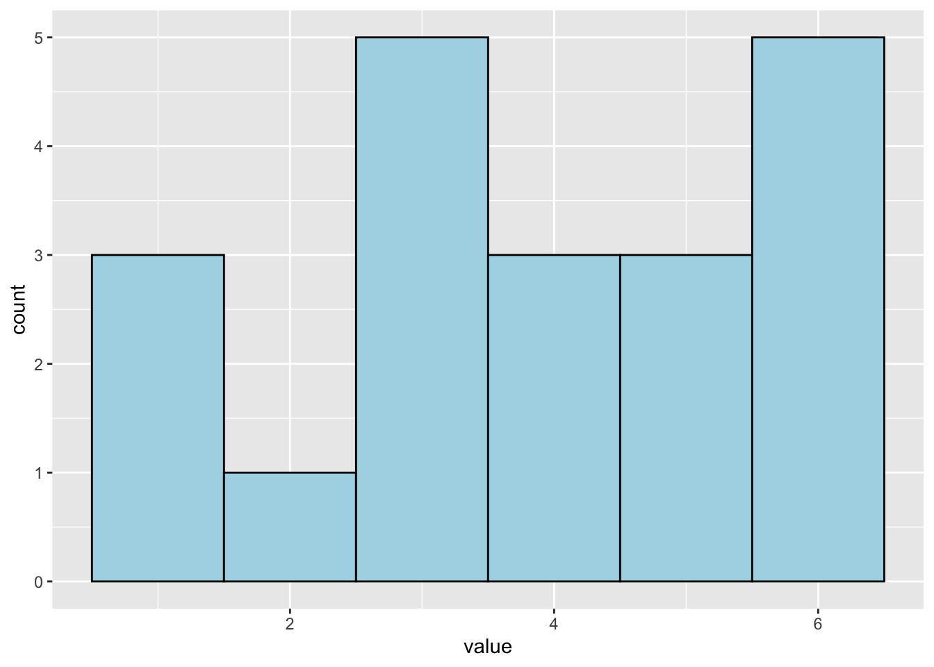
So, the histogram above shows the empirical distribution.
But why do we care about distribution?
In statistics, we often want to go beyond describing what we observed in a particular sample. We want to make inferences or predictions about a broader population or about how the data was generated.
To do that, we often compare the empirical distribution to a theoretical distribution (a mathematical model of how we expect the data to behave).
“Most model constructed in applied statistics assume that the data has been generated by a process following a certain distribution” (p.54)
There are several common theoretical distributions, such as Binomial distribution, Poisson distribution, and normal distribution. Today we are going to talk about the normal distribution.
Normal Distribution
The normal distribution is one of the most common distributions in statistics. It reflects a common pattern of data found in nature. It is used with continuous data.
For example, what are the heights of people in the world? (Here we are talking about population, right?)
It’s very hard or almost impossible to measure the height of every single person on Earth. Instead, we take a sample from the population and measure the heights of the people in our sample.
What would we expect to see?
We typically don’t find a large number of very short and very tall people. Most people’s height falls somewhere in the middle. If we plotted the heights of people in a histogram, we might see something like this:

This is what we call a normal distribution. The shape of the distribution looks like a bell (bell-shaped curve), where:
Most data points are clustered around the middle (mean)
Fewer data points are at the two-ends.
:max_bytes(150000):strip_icc():format(webp)/bellcurve-2adf98d9dfce459b970031037e39a60f.jpg)
Another (more technical) name for this distribution is the Gaussian distribution.
Many statistical methods for continuous variables assume that data follow a normal distribution. Even when the data don’t look perfectly normal, they are often approximately normal if the sample size is large enough.
This idea comes from the principle called the Central Limit Theorem (CLT).
Mean and SD as parameters of normal distribution
Let’s look at the normal distribution of this made-up data
set.seed(165)
height_sample <- tibble(value = rnorm(n = 2000, m = 165, sd = 5))ggplot(height_sample, aes(x = value)) +
geom_density() +
scale_x_continuous(limits = c(145, 185), breaks = c(145,150, 155, 160, 165, 170, 175, 180, 185)) +
labs(x = "height (cm)",
title = "Height data from 2000 people")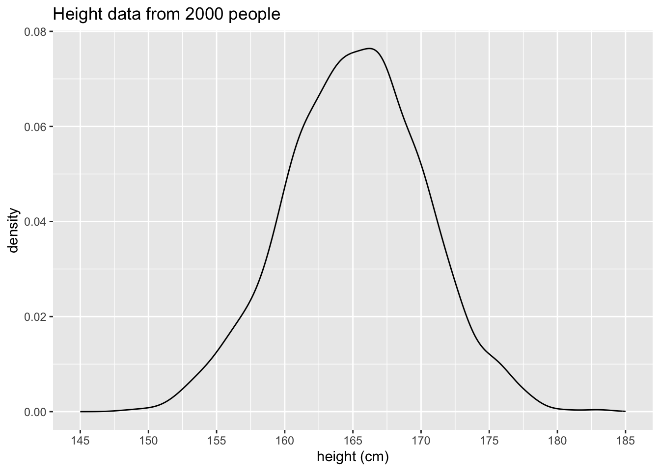
Mean: Centre of the bell curve
The mean is what most people think of as the average of the data. It is calculated by adding up all the values and dividing by the number of observations (n).
R command: mean( )
Standard Deviation (SD): How spread the curve is
The standard deviation tells us how much the data are spread out from the mean.
If the SD is small, most observations are close to the mean
If the SD is large, the data are more spread out from the mean
To calculate the SD, subtract the mean from each data point, square the value, sum these squares, and then divide by the total sample size minus 1 (n-1) #I copied Stephen’s word here
But simply, R command: sd( )
How Mean and SD are important in the normal distribution
The mean and SD are parameters (properties) of the normal distribution. Changing each parameter changes the position and shape of the distribution.
Changing the mean shifts the curve to left or right
Changing the SD makes the curve wider or narrower
Another important role of these parameters is to help us understand probability.
Consider this standard normal distribution (mean = 0, sd = 1)
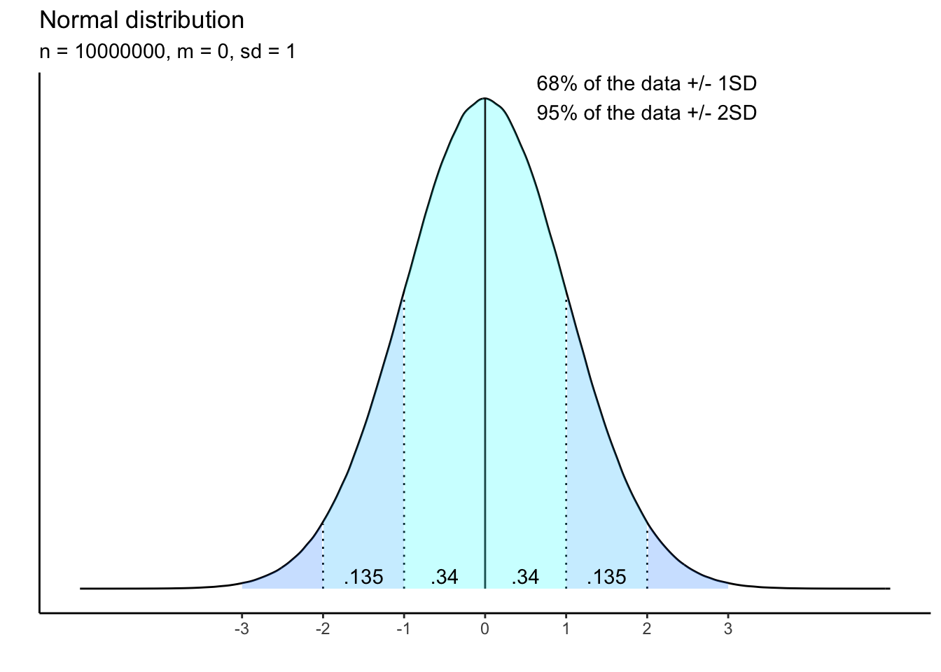
We already know that in a normal distribution, most of the data cluster around the mean. But how much is most?
The theoretical distribution above shows a property of the normal distribution. The number in the shaded areas show the probability that the data fall in those areas.
The light-blue shaded area, covering the area from -1 SD to 1 SD, contains the probability of 0.68 (0.34 on each side, added up to 0.68) or 68%. This means that if you randomly select a data point from this standard normal distribution, there is 68% chance that data point will fall within 1 SD from the mean.
If we extend the area to -2 SD to 2 SD, the total area under the curve will add up to 0.95 or 95%. So, 95% of the data fall within 2 SD from the mean.
Is number 95% or 0.95 familiar? If not, what about 1 - 0.95 = 0.05
What is the importance of a normal distribution?
The distribution is fundamental to other descriptive statistics. Mean, quantiles, and range are described based on the data distribution. Wait for Mahnaz next week.
In inferential statistics, several commonly used tests, such as t-test, ANOVA, assume that the data are sampled from a population that follows a normal distribution. It means that before running these tests, it’s important to check whether your data is approximately normally distributed.
If the data don’t meet the normality assumption, the results of these tests may be unreliable or invalid. In that case, you may need to transform the data or use non-parametric tests.
Linguistics Data Examples
- Let’s talk about your data… Do you have continuous variables in your data?
My data… Yes I have continuous variables. Here are some of them…
sample_dat <- read.csv("NMdata_A.csv")
head(sample_dat)
speaker_Idx sl_rowIdx syllable vlength duration intensity
1 F001 1 ? @:_2 long 458.125 72.36905
2 F001 2 k_h 1:_1 long 153.250 53.00022
3 F001 3 j a:_2 k long 263.375 68.34368
4 F001 4 c a_2 short 173.125 55.65096
5 F001 5 t r ua_2 t long 231.875 57.25882
6 F001 6 ? a_1 n short 207.125 62.90858I have two continuous variables in this data frame: duration and intensity.
How can we check whether these observations are normally distributed?
histogram (ggplot)
density plot (ggplot)
QQ plot (base R)
ggplot(sample_dat, aes(x = duration)) +
  geom_histogram()
`stat_bin()` using `bins = 30`. Pick better value `binwidth`.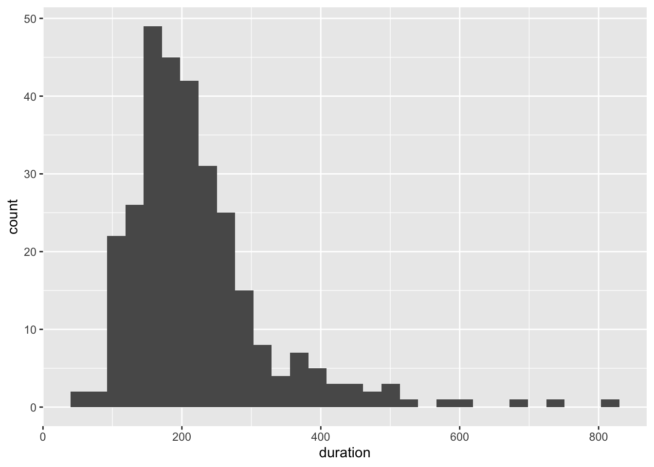
ggplot(sample_dat, aes(x = duration)) +
  geom_density()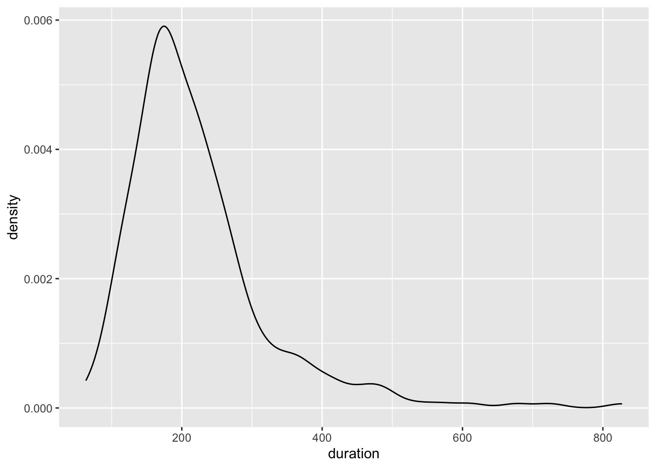
qqnorm(sample_dat$duration)
qqline(sample_dat$duration)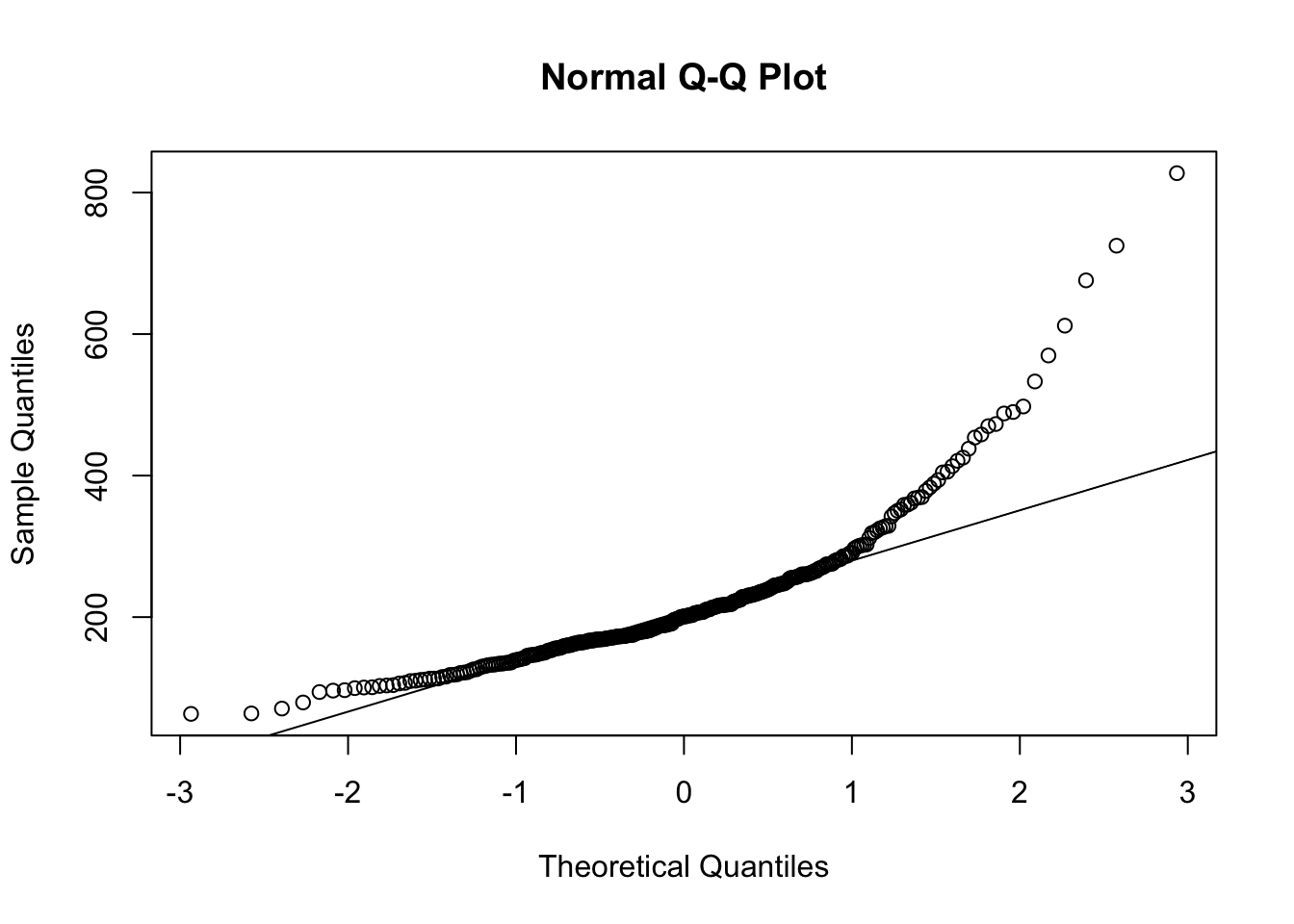
Oops! Not normally distributed…
Calculate mean and sd from the dataset
mean(sample_dat$duration)[1] 222.4221sd(sample_dat$duration)[1] 104.1929Bonus: If the data is left- or right-skewed (not approximately normally distributed), mean is probably not a good summary for the centre. Any idea why?
Use median instead.
Practice
- Investigate the distribution of ‘intensity’
- Calculate mean and SD for each variable.
Final question
For those who already have data: is your data normally distributed? And does it matter?
Downloads
Use this link to download this .qmd file and sample data.