# Loading library
library(ggplot2)Summary Statistics and Boxplots
3.4 Thinking of the Mean as a Model
Descriptive and Inferential statistics
While descriptive statistics is understood to involve things like computing summary statistics and making plots, inferential statistics is generally seen as those statistics that allow us to make ‘inferences’ about the population.
However, the distinction between descriptive and inferential statistics is not as clear-cut:
any description of a dataset can be used to make inferences
all inferential statistics are based on descriptive statistics
🤔So let’s think of the mean as a model of a dataset:
The mean can be thought of as a model of a dataset: a simplified representation of distribution that captures a central tendency. It can also be used to make predictions when we have no other information. For example, if we don’t know the score of a new observation, the mean of the sample is our best guess.
set.seed(123)
# Generate random numbers from a normal distribution
data <- rnorm(100, mean = 5, sd = 1)
mean(data)
[1] 5.090406Here, the mean is our best model for any new prediction when no other information is available.
In applied statistics, we almost always deal with samples as the population is generally not available to us.
Samples are used to estimate population parameters.
✏️ Conventionally, parameters are represented with Greek letters and sample estimates with Roman letters:
x̄ and μ (Mean): sample mean x̄ estimates the population parameter μ
s and σ (Standard deviation)
s2 and σ2 (Variance)
3.5 Other Summary Statistics: Median and Range
- Median: the middle value when data are sorted; more robust to extreme values than the mean (50% of the data are above the median; 50% of the data are below).
- Range: the difference between the largest and smallest values; sensitive to extreme values. Note that as a general measure of spread, the range is not as useful because it exclusively relies on the two most extreme numbers, ignoring all others.
The mean incorporates more information because it cares about the actual values of the data points. The median only cares about its position in an ordered sequence.
median(data)[1] 5.061756range(data)[1] 2.690831 7.187333diff(range(data)) # The range[1] 4.496502set.seed(123)
data2 <- rnorm(200, mean = 5, sd = 5)
mean(data2)[1] 4.957148median(data2)[1] 4.706316range(data2)[1] -6.545844 21.205200diff(range(data2)) [1] 27.751043.6 Boxplots and the Interquartile Range (IQR)
A boxplot visualises the median, quartiles, and possible extreme values.
- Q1: 25th percentile (25% of all data points fall below this value)
- Q3: 75th percentile (75% of all data points fall below this value)
- IQR: Q3 − Q1 (the extent of the box = 50% of the data)
- Whiskers: extend to the largest/smallest value within 1.5 × IQR from Q1 or Q3
- Dots: extreme values outside whiskers (often called outliers)
What can we conclude?
summary(data) Min. 1st Qu. Median Mean 3rd Qu. Max.
2.691 4.506 5.062 5.090 5.692 7.187 # Boxplot
boxplot(data, main = "Example Boxplot", ylab = "Values")
Visualising with ggplot2
df <- data.frame(values = data)
ggplot(df, aes(x = "", y = values)) +
  geom_boxplot(
    outlier.colour = "plum3", fill = "cadetblue3") +
  labs(title = "Boxplot with IQR", y = "Values") +
  theme_minimal()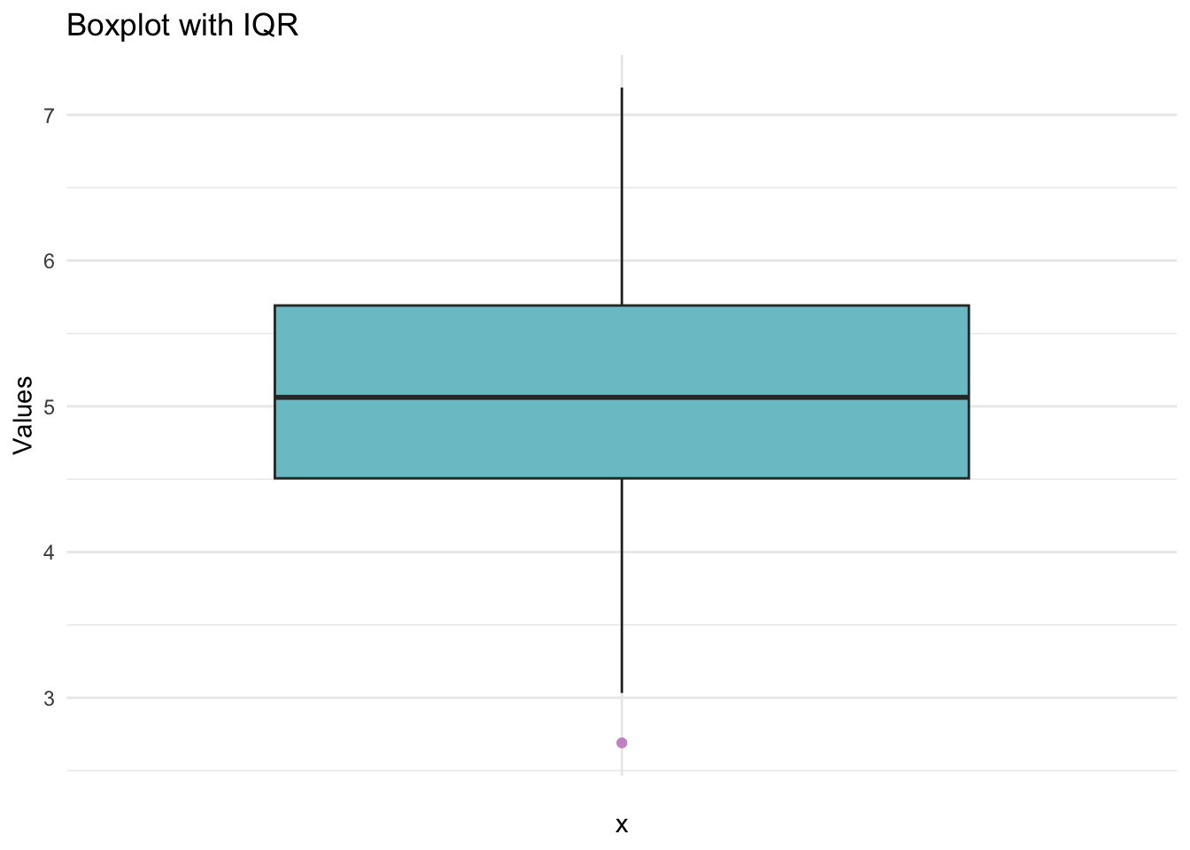
It’s a good idea to re-state the definition of the whiskers in the figure caption, especially if you change the extent of the whiskers—it’s good to give people reminders/ heads-ups.
🎨Tip:
To see colours available in base R:
colours()Type the name of the color in quotes (e.g., ‘turquoise’) to see the colour.
#'thistle2' and 'turquoise'df <- data.frame(values = data)
ggplot(df, aes(x = "", y = values)) +
geom_boxplot(
notch = T, coef = 1,
outlier.colour = "plum3", fill = "cadetblue3") +
labs(title = "Boxplot with IQR", y = "Values",
caption = 'whiskers represent interquartile range * 1') +
theme_minimal()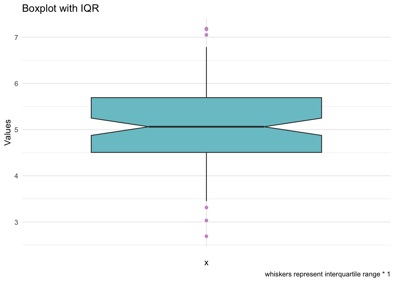
📌Key points - Boxplot
Range = max – min
IQR (inter-quartile range) = UQ – LQ
Boxplots are a good summary of a numerical (usually continuous) variable
show the distribution of the numbers (skewed, symmetric)
show summary statistics (5-number summary)
minimum (the smallest number that falls within a distance of 1.5 * IQR)
lower quartile
median
upper quartile
maximum
Outliers lie more than 1.5 × IQR away from either end of the box (above UQ or below LQ)
🧨Tip from BW:
I suspect that many people in the language sciences may not be able to state the definition of the whiskers off the top of their heads. If you want to make new friends at an academic poster session, next time you spot a boxplot, ask the poster presenter to define the whiskers 😇
📝Key points - Today
- The mean is a model that summarises data and can be used for predictions.
- The median is more robust to extreme values.
- The range describes spread but is sensitive to extremes.
- The boxplot summarises data using median, quartiles, IQR, whiskers, and extreme values.
Downloads
Use this link to download this .qmd file.