e.g., Addition: adding 1 to (2, 4, and 6) -> (3, 5, and 7)
Why is it useful?
Interpretational advantages
Makeing variables comparable
5.1 Centering
‘Centering’ is a linear transformation often used with continuous predictor variables, subtracting the mean of a variable from each of its values, so the data are expressed as deviations from the mean. If each data point is expressed in terms of how much it is above the mean (positive score) or below the mean (negative score), this will be useful for the intepretation. Let’s see examples;
Log word frequency as the predictor of response durations
Uncentered:
The intercept = predicted response time when log frequency = 0.
Centered:
0 = the mean log frequency.
The intercept = predicted response time at the average frequency.
library(tidyverse)
── Attaching core tidyverse packages ──────────────────────── tidyverse 2.0.0 ──
✔ dplyr     1.1.4     ✔ readr     2.1.5
✔ forcats   1.0.1     ✔ stringr   1.5.2
✔ ggplot2   4.0.0     ✔ tibble    3.3.0
✔ lubridate 1.9.4     ✔ tidyr     1.3.1
✔ purrr     1.1.0
── Conflicts ────────────────────────────────────────── tidyverse_conflicts() ──
✖ dplyr::filter() masks stats::filter()
✖ dplyr::lag()    masks stats::lag()
ℹ Use the conflicted package (<http://conflicted.r-lib.org/>) to force all conflicts to become errors
library(broom)# Load the datasetELP <-read_csv("ELP_frequency.csv")
Rows: 12 Columns: 3
── Column specification ────────────────────────────────────────────────────────
Delimiter: ","
chr (1): Word
dbl (2): Freq, RT

ℹ Use `spec()` to retrieve the full column specification for this data.
ℹ Specify the column types or set `show_col_types = FALSE` to quiet this message.
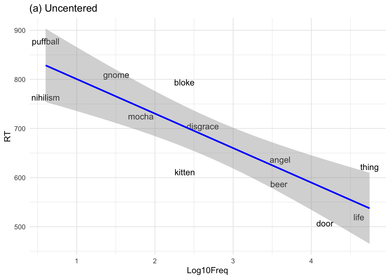
# Plot with uncentered log frequencyELP %>%ggplot(aes(x = Log10Freq, y = RT)) +geom_text(aes(label = Word)) +geom_smooth(method ="lm", color ="blue") +ggtitle("(a) Uncentered") +theme_minimal()
`geom_smooth()` using formula = 'y ~ x'
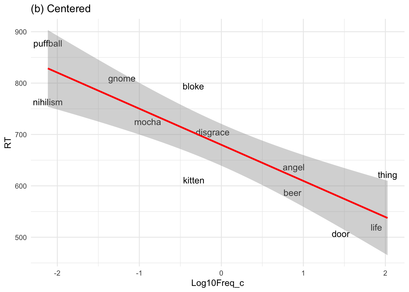
# Plot with centered log frequencyELP %>%ggplot(aes(x = Log10Freq_c, y = RT)) +geom_text(aes(label = Word)) +geom_smooth(method ="lm", color ="red") +ggtitle("(b) Centered") +theme_minimal()
`geom_smooth()` using formula = 'y ~ x'
Notice that the slope of the regression line does not change when moving from (a) to (b).
Another example based on Winter (2019, p. 87):
“In some cases, uncentered intercepts outright make no sense. For example, when performance in a sports game is modeled as a function of height, the intercept is the predicted performance someone of 0 height. After centering, the intercept becomes the predicted performance for a person of average height, a much more meaningful quantity.”
Maybe something like high jump? ([Irasutoya: Free illustrations for personal and commercial use](https://www.irasutoya.com/2014/05/blog-post_9118.html))
Uncentered (raw height):
The intercept = predicted jump height for someone 0 cm tall. –> That’s meaningless, because no athlete has a height of zero.
Centered (mean height):
0 now represents the average athlete’s height (say, 172 cm).
The intercept = predicted jump height for an athlete of average height, which makes sense.
The slope (how much jump height changes per cm of body height) stays the same before and after centering.
5.2 Standardizing (z-scoring)
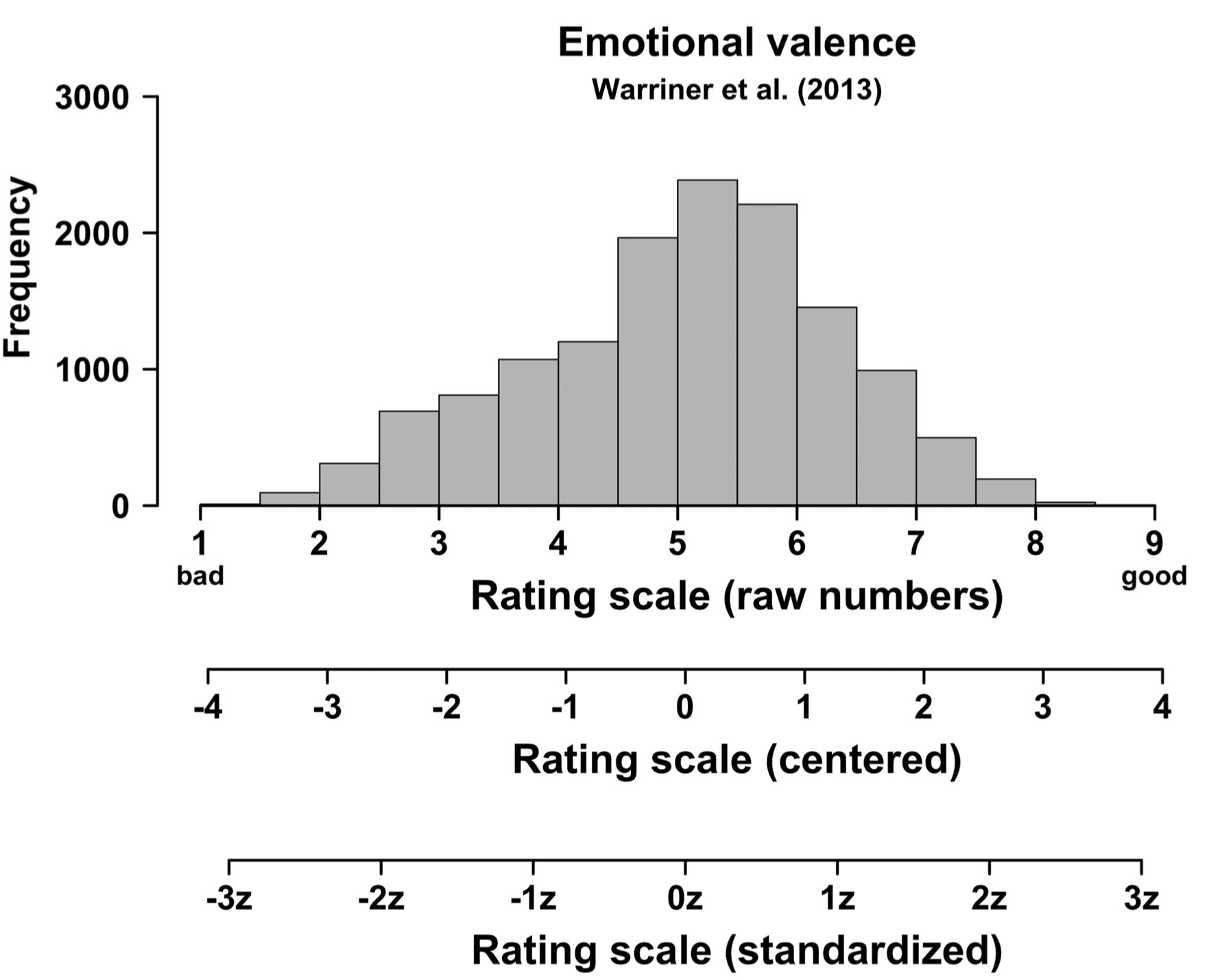
‘Standardizing’ or ‘z-scoring’ means centering a variable (subtracting its mean), then dividing by its standard deviation. So, each data point is expressed in terms of how many standard deviations it is above (+) or below (–) the mean. Let’s see an example;
Response durations from a psycholinguistic experiment
# Example response durationsRTs <-c(460, 480, 500, 520, 540)# Mean and standard deviationmean_RT <-mean(RTs)sd_RT <-sd(RTs)mean_RT
[1] 500
sd_RT
[1] 31.62278
# Center the values (subtract the mean)RTs_centered <- RTs - mean_RTRTs_centered
Note that standardization changes the units of measurement to ‘standard units’ (often represented by letter z), but not the relative relationships among data points (As can be seen Winter, 2019, p.88).
Winter (2019, p.88)
# Standardized predictorELP <-mutate(ELP, Log10Freq_z =scale(Log10Freq))# Standardized modelmdl_z <-lm(RT ~ Log10Freq_z, data = ELP)# Compare to unstandarized modeltidy(mdl_unc)
The slope appears different (–70 –> –101) because standardizing changes the units from raw values to standard deviations. The model itself hasn’t changed; the new slope shows the effect of a 1 standard deviation change in the predictor.
So what’s standarizing good for?
Removes the original metric of a variable
May help in making variables with different scales comparable
Useful for assessing the relative impact of multiple predictors
What if you standardized the response variable as well?
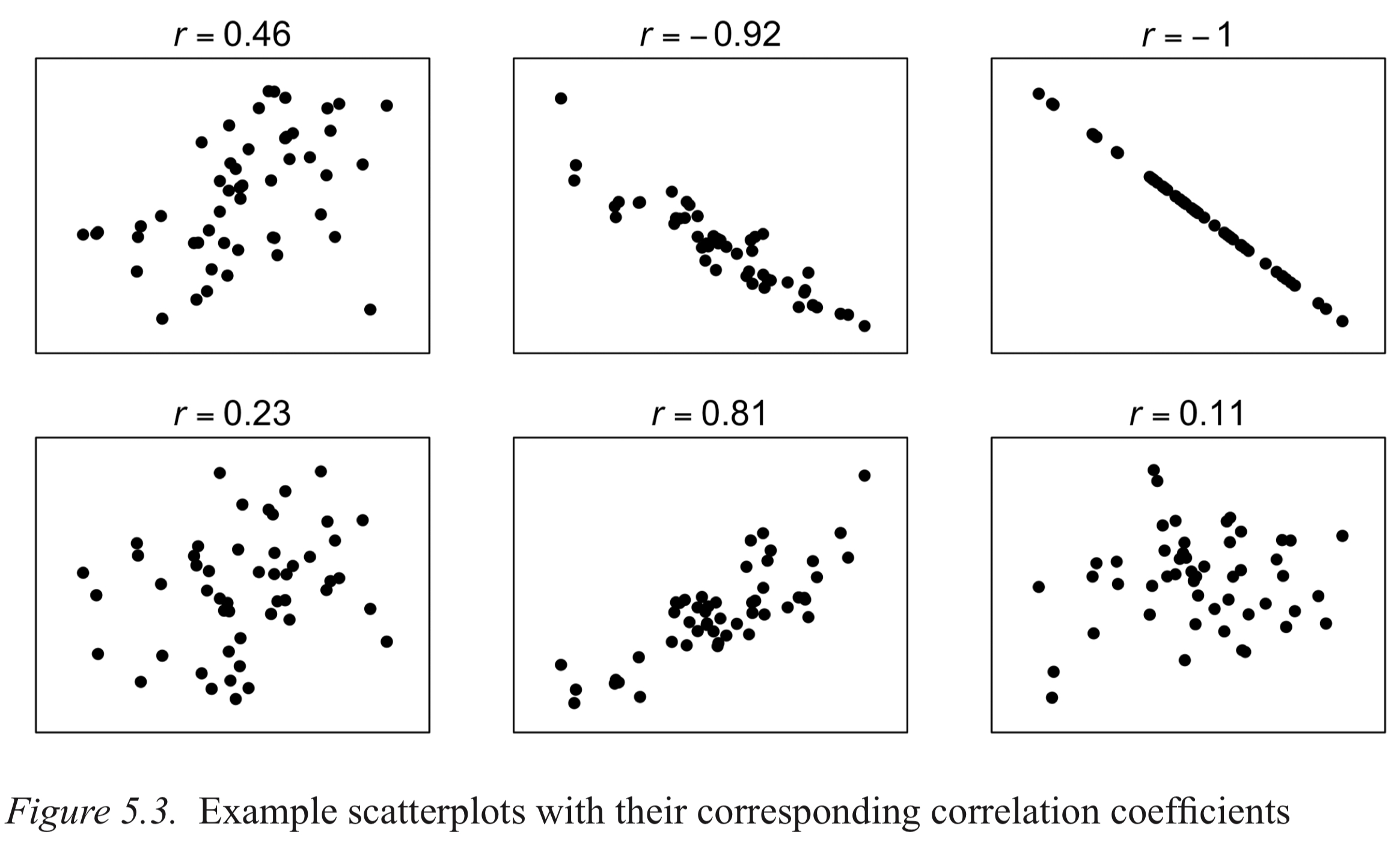
If both predictor and response are standardized, the regression slope becomes Pearson’s r, showing how many standard units y changes per standard unit change in x.
Pearson’s r is a standardized measure, so you can interpret correlation strength without knowing the data’s units. Can you draw a mental picture of what the correlation looks like?
Winter (2019, p.90)
Whether a given r is “high” or “low” depends on domain knowledge. For example, r = 0.8 is very high in psychology/linguistics, but may be considered low in quantum chemistry.
Have you already seen another standarized statistic?
R², the coefficient of determination, measures how much variance a model explains. In simple linear regression with one predictor, R² is just the square of Pearson’s r.
Extra. A ‘Cookbook’ Approach?
The textbook says “This book is not a ‘cookbook’ that teaches you a whole range of different techniques”, meaning it focuses on modeling rather than on picking different statistical methods. But my dataset is different — it’s ordinal, not continuous, and this book covers only Pearson’s r for correlation. Can you take a look and think about a good method for analyzing it?
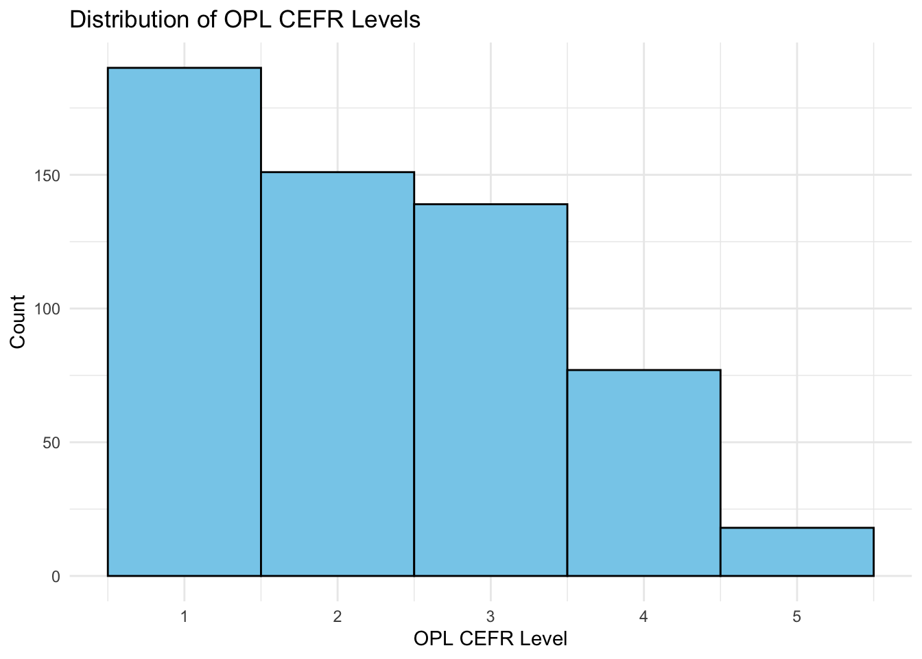
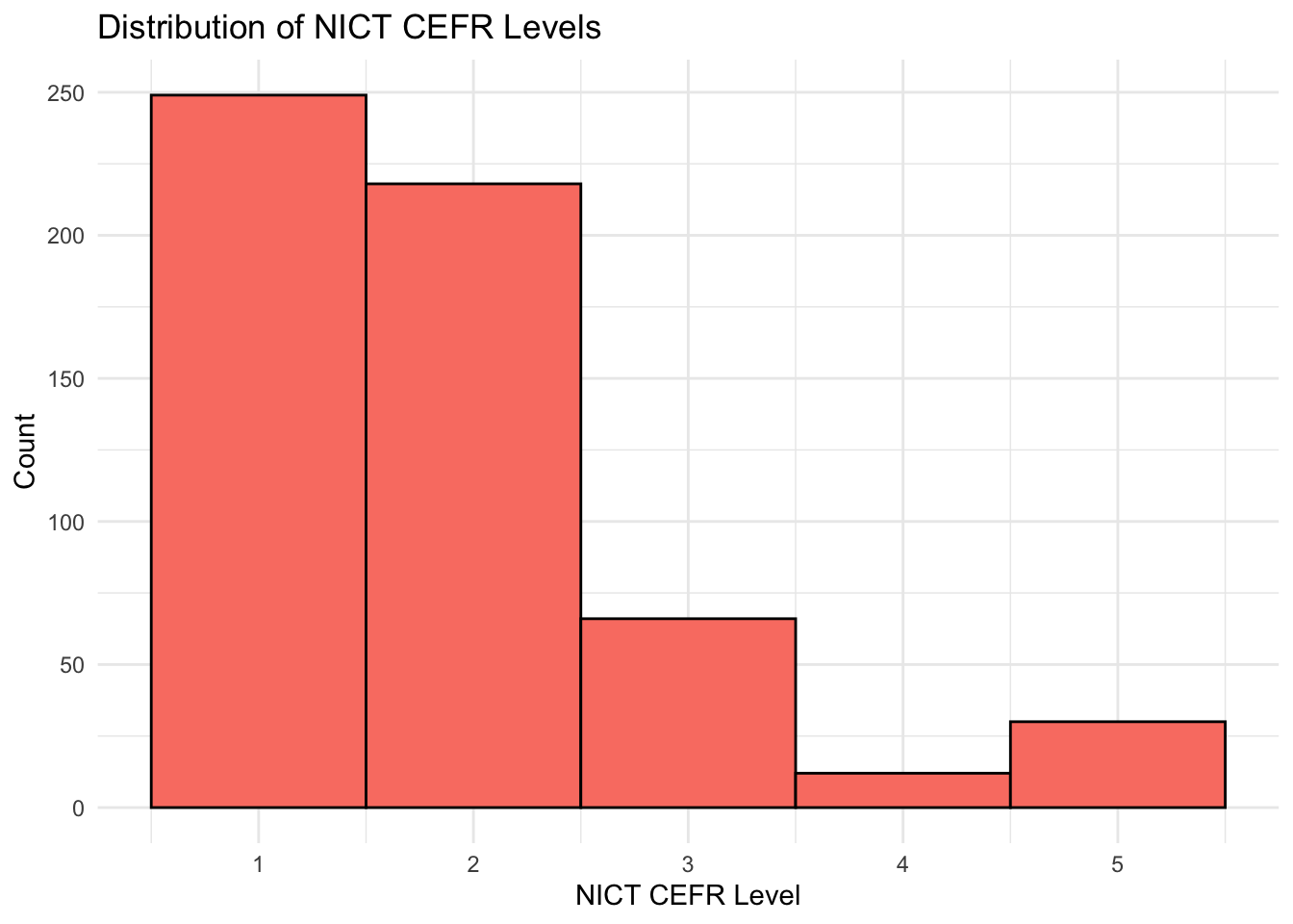
The NICT_CEFR column is based on a corpus of 1,281 Japanese EFL learners and 20 native speakers, including speakers’ levels (A1–B2 and Native). I extracted 575 phrases from the corpus, based on the Oxford Phrase List (OPL), which assigns CEFR levels to each item (A1–C1). To compare learners’ usage with the Oxford levels (OPL_CEFR), I identified the earliest proficiency level at which each phrase was used in the corpus (NICT_CEFR). For example, the A1-level OPL phrase “a few” was first used by learners at the A1 level in the corpus. Both sets of CEFR levels were then converted to ordinal codes (A1 = 1, A2 = 2, B1 = 3, B2 = 4, C1/Native = 5).
Let’s see the distributions.
data$OPL_lab <-factor(data$OPL_CEFR, levels =1:5)data$NICT_lab <-factor(data$NICT_CEFR, levels =1:5)# Histogram for OPL CEFRggplot(data, aes(x = OPL_CEFR)) +geom_histogram(binwidth =1, color ="black", fill ="skyblue") +labs(title ="Distribution of OPL CEFR Levels", x ="OPL CEFR Level", y ="Count") +theme_minimal()
# Histogram for NICT CEFRggplot(data, aes(x = NICT_CEFR)) +geom_histogram(binwidth =1, color ="black", fill ="salmon") +labs(title ="Distribution of NICT CEFR Levels", x ="NICT CEFR Level", y ="Count") +theme_minimal()
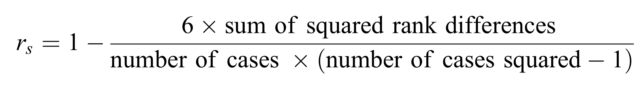
According to Brezina (2018, Chapter 5, Register Variation – Correlation, Clusters and Factors), Spearman’s correlation is used for ordinal data or scale data that do not meet parametric assumptions. Rather than using raw values, it computes the association based on ranks, measuring the relationship through the differences between ranks instead of means and standard deviations.
Brezina (2018, p.146)
Let’s do a manual calculation and compare the result with that of cor_test function.
# Manual calculationOPL_rank <-rank(data$OPL_CEFR)NICT_rank <-rank(data$NICT_CEFR)# Differences of ranksd <- OPL_rank - NICT_rank# Square the differencesd2 <- d^2# Sum of squared differencessum_d2 <-sum(d2)# Number of observationsn <-nrow(data)# Using the formular_s_manual <-1- (6* sum_d2) / (n * (n^2-1))r_s_manual
    Spearman's rank correlation rho

data:  data$OPL_CEFR and data$NICT_CEFR
S = 14730623, p-value < 2.2e-16
alternative hypothesis: true rho is not equal to 0
sample estimates:
      rho
0.5350887
Did you get the same results between the two methods? If not, why?🤔
5.1-5.3 Key Takeaways
Linear transformations (centering and standardizing) can help make variables more interpretable and comparable.
Centering: Subtract the mean; shifts the reference point so the intercept represents the average value.
Standardizing (z-scoring): Subtract the mean and divide by SD; expresses values in standard deviation units, making predictors on different scales comparable.
Correlation: Standardizing both predictor and response transforms regression slopes into Pearson’s r.