How does the mean of a variable change based on some other variable?\(\leftarrow\) this is the condition
What example does Bodo Winter use? Word Frequency
Variable: Reading times as gathered through a lexical decision task
Condition: Word frequency values (how often does a word occur in general)
We can calculate an average frequency for word reading times. We can then see how that average moves if we have access to other information (a condition, an independent variable, etc.)
This is shown using data from the English Lexicon Project. I have collected similar data, but from L2 participants, with which we can re-create the same sort of plot.
dat <-read_csv('L2_ELP.csv')
Rows: 3318 Columns: 4
── Column specification ────────────────────────────────────────────────────────
Delimiter: ","
chr (1): word
dbl (3): RT, logWF, length

ℹ Use `spec()` to retrieve the full column specification for this data.
ℹ Specify the column types or set `show_col_types = FALSE` to quiet this message.
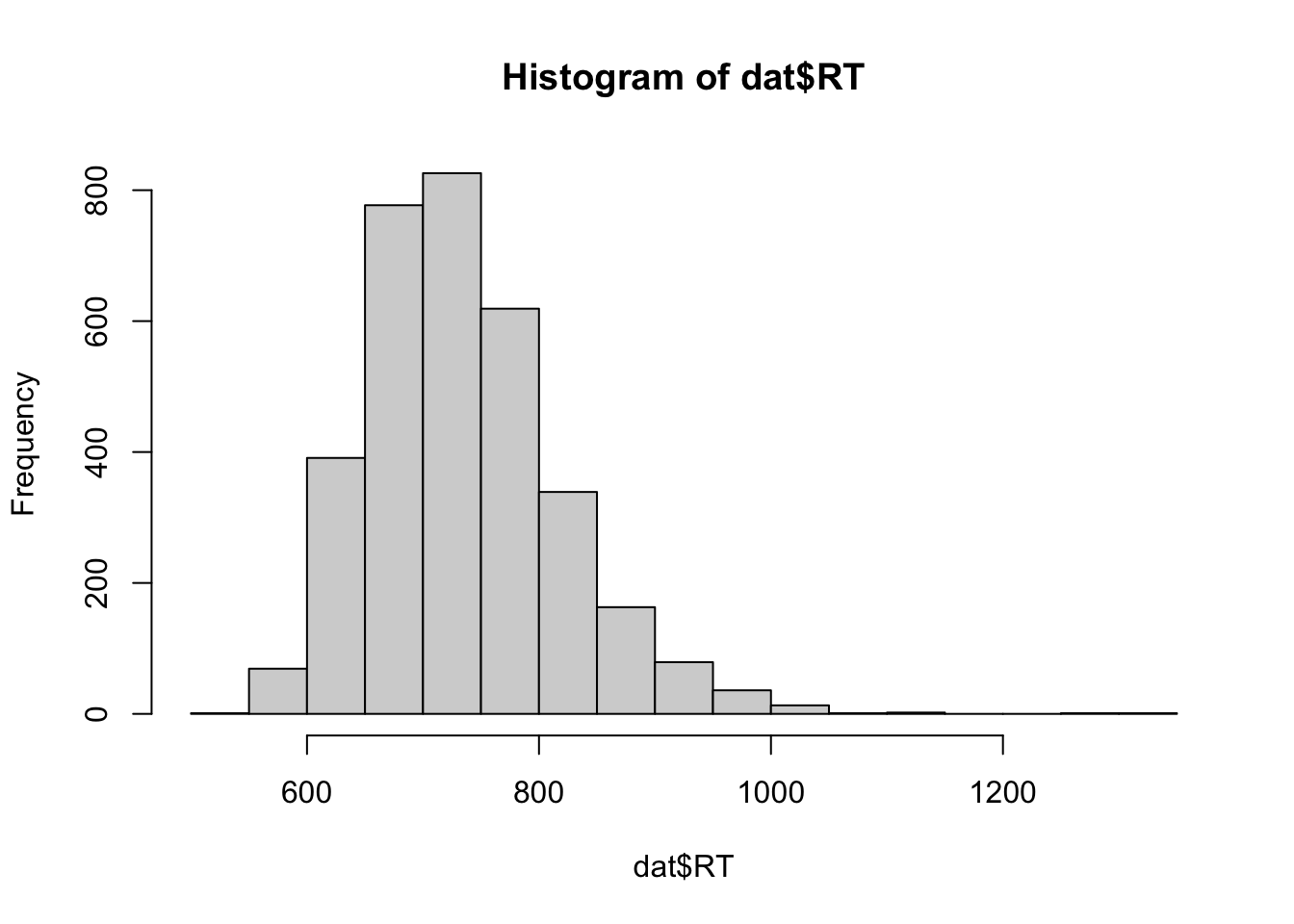
What is the distribution of RT?
summary(dat$RT)
   Min. 1st Qu.  Median    Mean 3rd Qu.    Max.
  540.7   675.2   724.9   734.2   781.4  1303.5
hist(dat$RT)
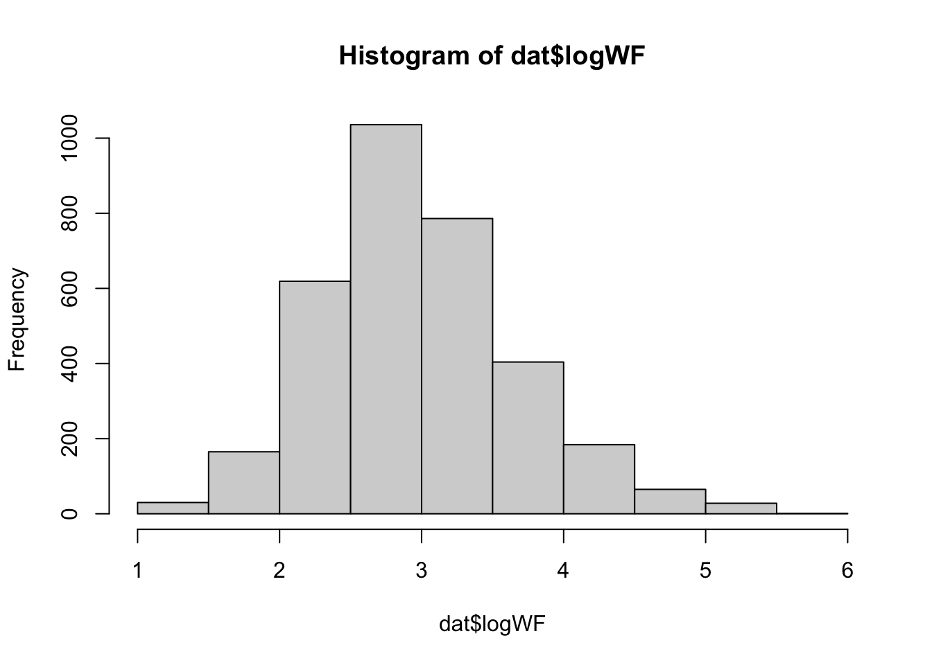
What is the distribution of word frequencies?
summary(dat$logWF)
   Min. 1st Qu.  Median    Mean 3rd Qu.    Max.
  1.000   2.509   2.906   2.977   3.382   5.538
hist(dat$logWF)
Basic components of a linear model
One way to think about this is whether the mean values can be better explained as a function of some predictor variable. We want to test the relationship of our outcome variable in the presence of a predictor variable. The outcome variable is normally depicted as y, and the predictor variables are depicted as x. The y variable is thus our dependent variable. The relationship between the two, with y varying as a function of x, can be depicted mathematically as:
\[
\Large y \sim x
\]
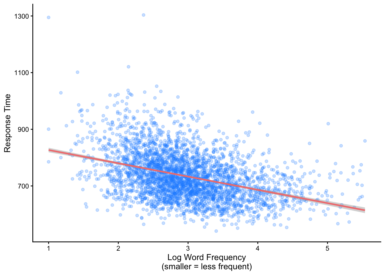
A linear model will answer whether and how the average response duration changes at different values of frequency
ggplot(dat, aes(y = RT, x = logWF)) +geom_point(alpha = .25, color ='dodgerblue') +geom_smooth(method ='lm', color ='lightcoral') +theme_classic() +labs(y ="Response Time", x ="Log Word Frequency\n(smaller = less frequent)")
Intercepts and Slopes
A linear regression is going to provide information about the \(y\) and the \(x\) in the form of a line or a solution defining the relationship between the two variables. The linear model will provide a line: where do we start on \(y\), and where do we end up for different values of \(x\)? This is the basic logic of the intercept and slope that is provided by linear models.
The intercept = starting position for \(y\)
The slope = the magnitude of the effect of \(x\) on \(y\).
More specifically, the slope is how much \(y\) changes for any one unit increase in \(x\) (i.e. an increase in logWF from 1 to 2). For the model I fit above, the (rounded) slope is -46.9.
This means that, for each one-unit increase in frequency, response times decrease by ~47ms.
Take a moment and look at the plot above - does this make sense?
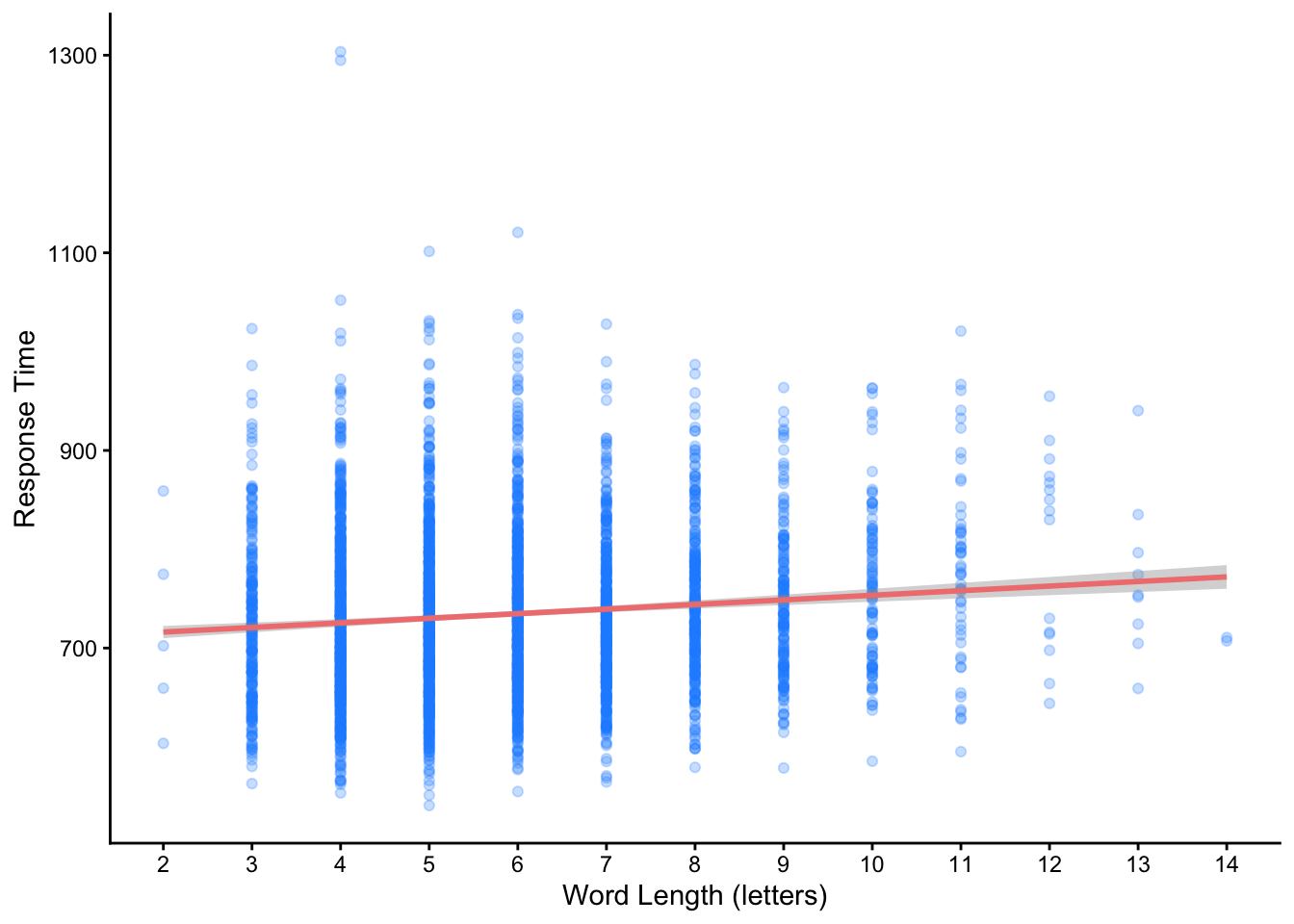
A positive slope
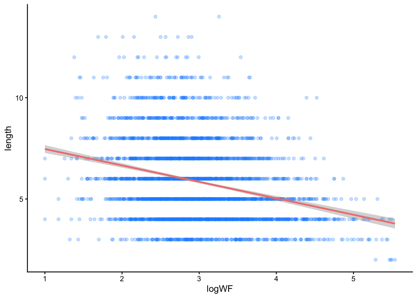
Slopes can go in positive and negative directions - here is the effect of word length on RT. What do you see?
ggplot(dat, aes(y = RT, x = length)) +geom_point(alpha = .25, color ='dodgerblue') +geom_smooth(method ='lm', color ='lightcoral') +theme_classic() +scale_x_continuous(breaks =c(2:14)) +labs(y ="Response Time", x ="Word Length (letters)")
Just like before, we can see how much \(y\) changes for any one unit increase in \(x\). Here the increase is for every letter of a word. For this model, the (rounded) slope is 4.7. This effect is therefore smaller than the effect of word frequency. Can you provide the interpretation in terms of the \(y \sim x\) language?
What is the intercept?
The intercept is simply where the slope starts on the y axis.
For our word frequency model, the intercept is 873.74,
For word length model, the intercept is 706.87
The intercept is different for these two models because when we add \(x\), the resulting predictions for \(y\) are now conditioned for all observations at that value of \(x\). This means we can determine the value of the intercept by knowing (1) where the intercept starts on the y axis and (2) the slope of \(x\). To calculate new predictions, we multiply the raw value of \(x\) by its slope and add it to the coefficient:
It’s not! So we have no idea how long it would take an L2 English user to respond to the word ‘aardvark’ - darn. However, the word ‘aardvark’ is in the SUBTLEXus frequency database, so we can obtain it’s log10WF, sweet! Here it is:
Aardvark logWF = 1.3424
So we can plug that value into our formula and obtain a predicted RT for the word ‘aardvark’! We will be lazy and round the coefficient to 47ms. The math would this be:
We would thus predict an L2 English speaker would take ~810ms to recognise the word ‘aardvark’. We have made a new prediction with information in our model. We can verify this using a built-in R function to predict new data :-)
I have fit a model behind the scenes, so don’t worry too much about this code here. Just know that I’m asking R to give us the prediction so you can check my math above.
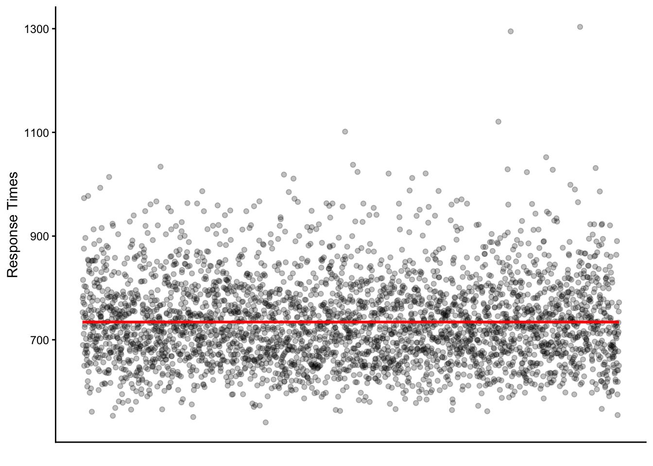
Do you remember - without an \(x\) variable, what is our best prediction of \(y\)? That’s right, the mean! So without any other information, the intercept of a linear model will be the mean of\(y\). Because there are no \(x\) predictor(s), there will be a slope of 0. It would look like this:
How many points are along the line?
How many are close to the line?
How many are far away?
The relative distance between the points and this intercept represents the predictive ability of the model (remember, the mean can be a model!). The difference between the actual value and the intercept form the residuals of the model. Smaller residuals mean the model did a better job predicting the actual data, whereas larger residuals mean the model is struggling to predict the data points. Think about this for a moment - does this make sense?
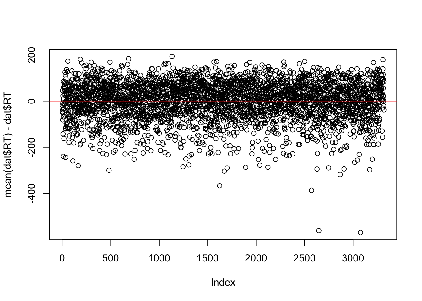
We could calculate the residuals for the model with just the mean quite easily, by subtracting the mean from each value:
plot(mean(dat$RT) - dat$RT)abline(h =0, col ='red')
Assessing the overall model fit
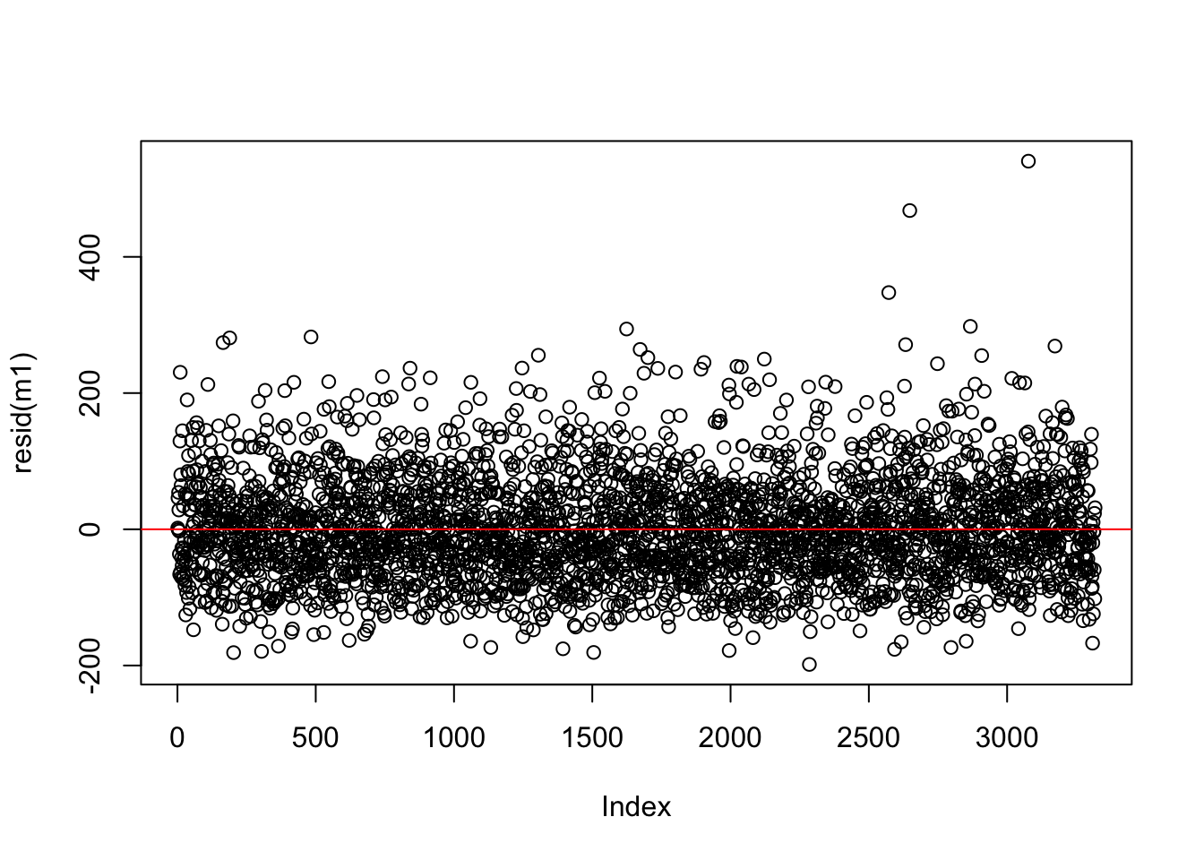
Let’s look at the residuals from the model which predicts RT using word frequency - is this any better than the model with only the mean? Can we quantify this?
plot(resid(m1))abline(h =0, col ='red')
The answer is yes, by summing all of the differences to get a total sum of the residuals. We however do this with the square of the residuals - which Bodo Winter reminds us is to remove negative values from the data. This is called the sum of squared errors (SSE)!
That’s a large number. Now let’s calculate the SSE from a model with RT as predictor. I fit this model as an object named m1 - we will learn how to do this in the next lesson. Just know for now that m1 is a linear model expressed as \(\text{RT} \sim \text{word frequency}\)
sum(resid(m1)^2)
[1] 19245061
The numbers are meaningless on their own - however the SSE for m1 is a smaller number than the SSE for the mean model. So what interpretation can we make? Which model has a smaller error?
Calculating \(R^2\)
In order to express the model’s overall fit, you can divide the SSE ratio between a model with predictors and the null model to get a ratio of “variance explained”. The “mean only” model is called the null model, because it has no additional information and represents a baseline for comparison. The math looks like this:
This means that word frequency explains ~15% of variance in response times when compared to the null, mean only model. The remaining 85% is attributed to other unexplained factors.
We can verify the \(R^2\) of the fit model itself:
summary(m1)$r.squared
[1] 0.1541864
What is the \(R^2\) of the word length model? Based on the \(R^2\), does this model explain more or less variance than the word frequency model?
summary(m2)$r.squared
[1] 0.01208926
Bonus
Based on this correlation, what might we predict about a model that includes both word frequency and word length as predictors?
cor.test(dat$logWF, dat$length)
    Pearson's product-moment correlation

data:  dat$logWF and dat$length
t = -17.28, df = 3316, p-value < 2.2e-16
alternative hypothesis: true correlation is not equal to 0
95 percent confidence interval:
 -0.3183288 -0.2558884
sample estimates:
       cor
-0.2874139
`geom_smooth()` using formula = 'y ~ x'
Download
Use this link to download this .qmd file and sample data.