Review of key concepts from the last two sections:
Distribution
The Normal Distribution
Mean and SD as parameters of normal distribution
Thinking of the Mean as a Model
Other Summary Statistics: Median and Range
Boxplots and Interquartile Range
Summary Statistics in R
The goals for today’s session:
to observe more on random sampling from uniform and normally distributed data
to understand the relation between distribution and summary statistics
to summarize chapter 3
Uniform Data vs Normally Distributed Data
Generating Uniform Data
We can use the runif() function to generate uniform data. Specifically, this function enables us to create a set of random samples from a certain range with the same probability. Let’s try to generate 50 samples What can you notice from the generated data?
#Let's try to run a simple code with runif() function.data <-runif(50)data
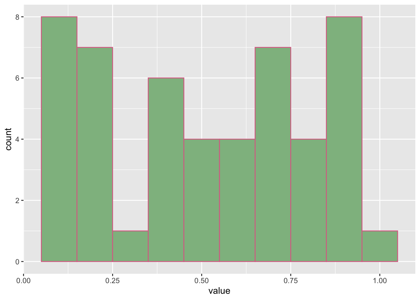
Using the code as above allows the data to be different every time we run it, but the data will still range from 0 to 1 as this is the default range. To see the distribution of the data, take a look at this ggplot. What can you say about the distribution of the data?
#load tidyverse to access ggplot() functionlibrary(tidyverse)
── Attaching core tidyverse packages ──────────────────────── tidyverse 2.0.0 ──
✔ dplyr     1.1.4     ✔ readr     2.1.5
✔ forcats   1.0.1     ✔ stringr   1.5.2
✔ ggplot2   4.0.0     ✔ tibble    3.3.0
✔ lubridate 1.9.4     ✔ tidyr     1.3.1
✔ purrr     1.1.0
── Conflicts ────────────────────────────────────────── tidyverse_conflicts() ──
✖ dplyr::filter() masks stats::filter()
✖ dplyr::lag()    masks stats::lag()
ℹ Use the conflicted package (<http://conflicted.r-lib.org/>) to force all conflicts to become errors
data <-data.frame(value = data)ggplot(data, aes(x = value)) +geom_histogram(binwidth =0.1, color ='palevioletred', fill ='darkseagreen')
Since the data are randomly uniform, the data are not sampling from the normal distribution. Instead, the data are sampling assuming equal probability of occurrence. Thus, you can see that the distribution captures approximately the same number of occurrences. The more data you generate, the more ideal the histogram will be.
Generating Normally Distributed Data
The rnorm() function is used to generate random samples from a normal distribution. Let’s also try to generate 50 samples What do you notice when you run the code?
#Let's try to run a simple code with rnorm () function.data <-rnorm (50)data
By default, rnorm(50) generates 50 samples from a normal distribution with a mean of 0 and standard deviation of 1. The default range is set to infinity to allow normal distribution. However, we can always set the range to our needs. Let’s generate data again using rnorm(), but this time we specify the mean and SD.
#let's generate data by specifying the mean and SDdata <-rnorm (50, mean =5, sd =2)data
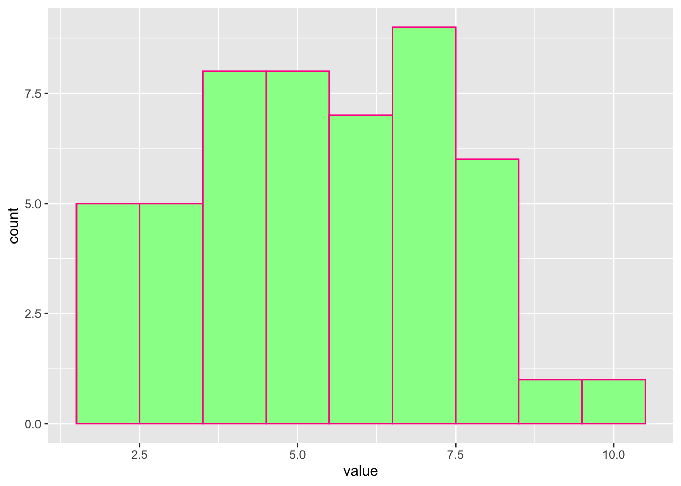
We now also create histogram from this data. What can you notice from the histogram?
#to create a histogram, we need to create a dataframe where value is a column that contains the data.data <-data.frame(value = data)#now create a ggplotggplot(data, aes(x = value)) +geom_histogram(binwidth =1, color ='deeppink', fill ='palegreen')
From the histogram below we can see that even though the data are sampled from the normal distribution, the distribution does not really show the ideal bell curve. Lets try to generate more samples.
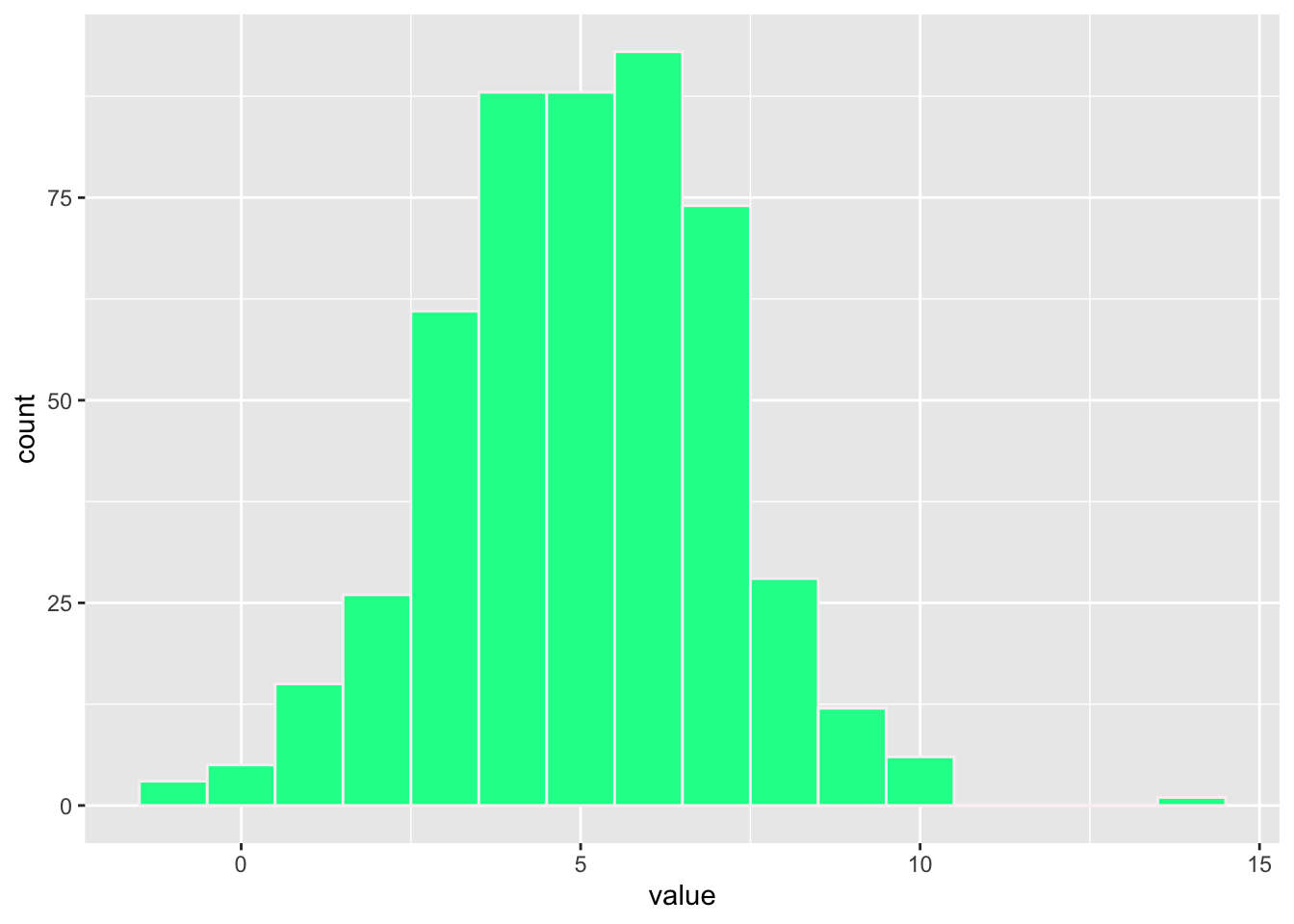
#generate bigger data with the same mean and SDdata <-rnorm (500, mean =5, sd =2)
Now, let’s create histogram from this data. This time, what do you notice?
#Again, make sure the data are stored in the 'value' column data <-data.frame(value = data)#Generate the ggplotggplot(data, aes(x = value)) +geom_histogram(binwidth =1, color ='lavenderblush', fill ='mediumspringgreen')
So why do you think it is important for us to look at the differences between random samples drawn from uniform and normally distributed data?
Relationship between Summary Statistics and Distributions
Do you still remember the relationship between mean, SD, and distribution? Let’s explore more to jog your memory.
We know the simple way to get mean and SD from our data.
#Now that we have our data in 'value' column, we need to call them with $ symbol.mean(data$value)
[1] 5.024381
sd(data$value)
[1] 1.997442
Another function that is very helpful in relation to summary statistics is quantile(). The quantile() function can help us look at the data within specific percentiles. This is beneficial if we want to look at Q1 (the 25th percentile), Q2 (the 50th percentile), and Q3 (the 75th percentile).
#putting $ symbol is important since the data are now inside the 'value' column.quantile (data$value)
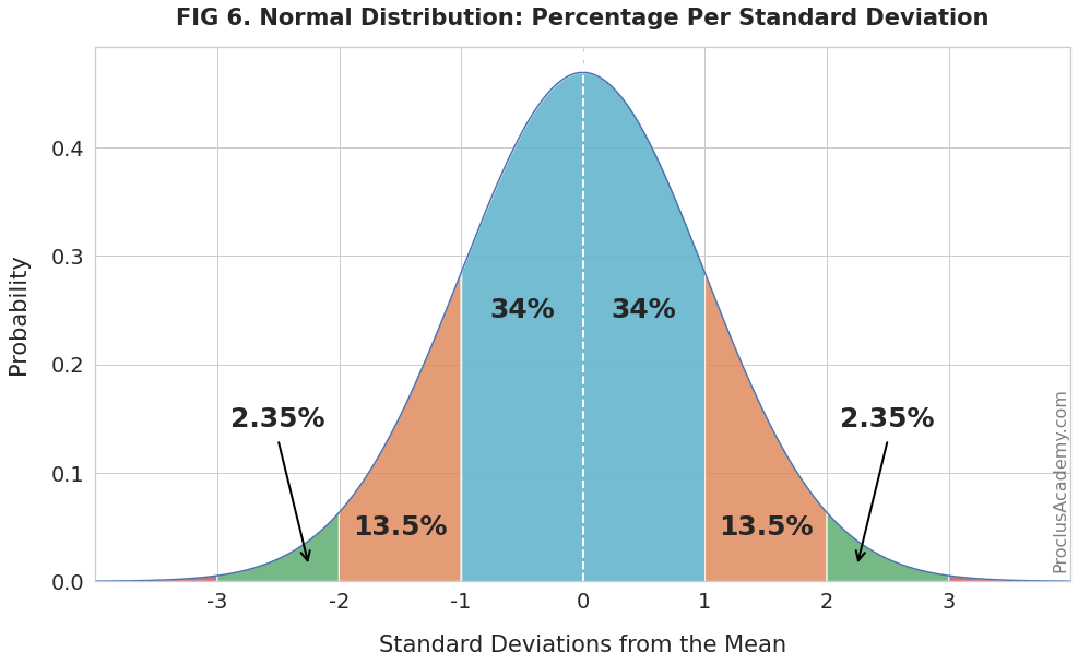
Do you still remember the 68% - 95% rule in the normal distribution? Right! 68% of normally distributed data data lie within 1 standard deviation of the mean and 95% of data lie within 2 standard deviations of the mean. Based on the same rule, it is found the 68% of data corresponds to the 16th and 84th percentiles.
From Proclus Academy, 2025 (proclusacademy.com)
Thus using the function quantile() we can find the range of 68% of these normally distributed data.
#Finding the range of our 68% dataquantile (data$value, 0.16)
     16%
2.935111
quantile (data$value, 0.84)
     84%
6.910648
Since the data are sampling from the normal distribution, this mean that 68% percent of the data numbers should fall in the range between the 16% to 84% percentiles. With the same understanding, we can say that the 50th percentile is the mean. This mean that there is a strong relationship between summary statistics and distribution.
In other way around, we can check whether the data follows normal distribution by checking whether the 16th and 84th percentiles match the mean and SD. Here is what we can do:
#the results here match the 16th and 84th percentiles abovemean (data$value) -sd (data$value)
[1] 3.026939
mean (data$value) +sd (data$value)
[1] 7.021823
So what is the relation between summary statistics and distribution based on what we have discussed?
One thing is that in the ideal normal distribution, the 50th percentile is the mean and adding 1 unit of standard deviation to the mean equals to the 84th percentile and subtracting 1 unit of standard deviation from the mean equals to the 16th percentile. Would you have any other insights from our discussion?
In relation to our discussion, is it true that our data should follow the normal distribution? Why do we still talk about normal distribution from time to time?
Application on Data Emotional Valence Ratings
let’s load the data. You can find the data at this repository or download it with this notebook using the link at the end of the notebook.
war <-read_csv('warriner_2013_emotional_valence.csv')
Rows: 13915 Columns: 2
── Column specification ────────────────────────────────────────────────────────
Delimiter: ","
chr (1): Word
dbl (1): Val

ℹ Use `spec()` to retrieve the full column specification for this data.
ℹ Specify the column types or set `show_col_types = FALSE` to quiet this message.
There are two columns in the data frame: Word and Val. What do we need to do if want to find the range of Val? We can choose one of these three ways:
#1st wayrange (war$Val)
[1] 1.26 8.53
#2nd wayfilter(war, Val ==min(Val) | Val ==max (Val))
# A tibble: 2 × 2
  Word        Val
  <chr>     <dbl>
1 pedophile  1.26
2 vacation   8.53
Another function which is a bit more complicated that we can use:
#3rd wayfilter(war, Val %in%range(Val))
# A tibble: 2 × 2
  Word        Val
  <chr>     <dbl>
1 pedophile  1.26
2 vacation   8.53
What does %in% do?
# %in% is similar to x in y. Let's see the example:y <-c(2,4,6)2%in% y
[1] TRUE
We can use our knowledge on the data distribution from the previous subsection and see the distribution of these data. Let’s look at the mean and SD
mean(war$Val)
[1] 5.063847
sd(war$Val)
[1] 1.274892
We expect that 68% of the data falls between the percentile of 16% and 86%. Then we can find the rough number using mean () function and sd () function.
mean(war$Val) -sd(war$Val)
[1] 3.788955
mean(war$Val) +sd(war$Val)
[1] 6.338738
We can verify this by using quantile() function.
quantile(war$Val, c(0.16, 0.84))
 16%  84%
3.67 6.32
The value from (mean-SD) and (mean+SD) is very similar to the 16% and 84% percentiles respectively. Why do you think that happened?
The same way we can look at the median.
median(war$Val)
[1] 5.2
quantile(war$Val, 0.5)
50%
5.2
Key points
Each one of these three aspects (sample, mean, and standard deviation) affects distribution.
Summary statistics can help us understand the distribution of our data.
Practice
Now that we have completed chapter 3, let’s review our understanding by doing a simple practice exercise.
“First, create a data frame with specific sample, mean, and SD. You can use rnorm() or runif() funtions. Using ggplot, make a histogram, density plot, and/or boxplot from your data. Second, change one aspect from your data. You can change the sample number, the mean, or the SD. Make the same visualisations using ggplot. Do you notice differences in distribution. Share your findings!”
Summary of Chapter 3
Remember the key points mentioned in the beginning of our session, what are the things you still can recall from each?
Distribution
The Normal Distribution
Mean and SD as parameters of normal distribution
Thinking of the Mean as a Model
Other Summary Statistics: Median and Range
Boxplots and in Interquartile Range
Downloads
Use this link to download this .qmd file and the data.